I have a very specific way of building one. Show me a palette and I can point to the one colour that’s just off enough to make you anxious. At least that’s what it does to me.
What I’d never done was write it down. So every set of Design Guidelines I delivered carried a slightly different version of the same rule. Never wrong but never the same twice. And things kept changing. You can build your own design guidelines in pretty much any tool now: Canva, Claude, Gemini, take your pick.
 I started wondering why bother having Design Guidelines at all, and then I realized, mid tool-hop, exactly why: I needed a set of rules that meant the same thing no matter which tool was reading it, instead of getting reinterpreted every time. Stop stepping on my feet, Claude.
This post is about colour, but colour was the biggest single lesson in the whole exercise. (More on why I rebuilt the guidelines themselves in this post.)
One palette tells you nothing about whether a rule is actually a rule. Five at once is the only way to find out which parts of my process are custom to a brand and which parts are closer to science.
Twenty years in, most of what I know about colour lives in my hands and my gut, not on a page. I had a good process going, but once AI entered the picture it wasn’t solid enough to survive contact with it. I had to start thinking in tokens. AI’s language. Not the language of a human, and it still had to be presented to a client with guidelines that looked beautiful and premium, not like a spreadsheet dressed up as a deliverable.
The framework is fixed now. Six groups, in this order, and every client’s colours get mapped into them. There are plenty of other ways to build a colour palette. This is mine, built specifically for web and social. (Same reasoning behind the platforms changing but the fundamentals not.)
Surface. Brand colours. Greys. CTA. Additional. Semantic.
You’re welcome to look at the live version on my Design Guidelines page. I call it a media kit, because I can hand it to a contractor or an AI tool, and if someone just needs my logo, it’s all on one page. No hunting across five different tools. It’s also become my own personal spot to drop design links I want to keep track of because on my site it’s mostly just for me.
Here’s what I do in each section.
Surface colours
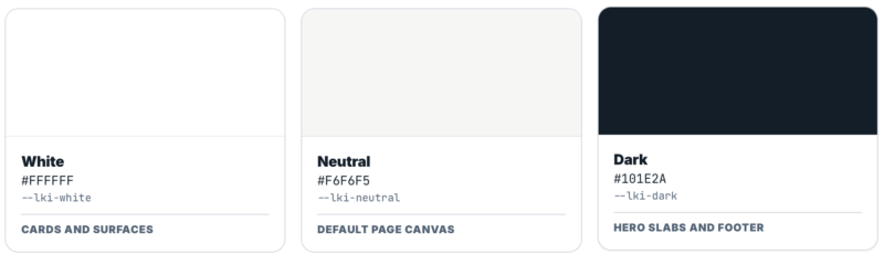
I pick three surfaces: white, neutral, dark. On a website, this is what everything else sits on. Two of them sit close enough in tone that I can alternate between them to separate sections with colour alone. The dark is usually the darkest tone in the brand palette, and that same dark becomes my text colour on white. Sometimes the dark runs the footer, a callout, or the background of a social post. The brand colours have to look right sitting on both the light and the dark.
Did that make sense? That’s what’s happening in my head when I choose surfaces. Seems so easy but it takes me a long time.
Brand colours
This is the brand. Starbucks green. Claude’s orange. The colour people think of before they think of anything else about you. Accents, highlights, icon strokes. Anything that should read as brand rather than as interface.
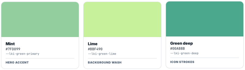
This is the group people expect to be the whole palette, but the number is not fixed. One client may need one recognizable brand colour and another may need several. LKI currently has four, each with a defined job. What matters is the role, not filling a quota. (More on how that recognition actually gets built in this post.)
Greys
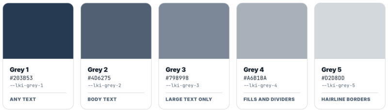
Five even steps, numbered dark to light, picked from the brand anchor colour.
This is a system inside the system. Give me the brand anchor colour and the ramp follows: five steps moving evenly in perceptual lightness, each carrying a hint of the brand hue instead of sitting at pure neutral. Mine run L* 24, 41, 56, 72, 86, so each step reads as the same size jump to a person, which is not what you get by nudging hex codes until they feel right.
So the values are custom on every brand, always, because the brand anchor is different every time. The method that produces them is not.
The tint matters more than it sounds. On a warmed palette I once added a pure neutral ramp and it read cold against everything around it.
The greys are also where the text colours live, and where the rule travels with the number. Grey 1 and 2 are safe for body text. Grey 3 works, but only large. Grey 4 and 5 are fills, dividers, and hairline borders, never type. The colour a reader meets most is not the logo and it’s not the brand green. It’s Grey 2.
Every hairline on a page comes off this ramp instead of a value picked in the moment. Skip that discipline and you get one edge sitting at three different strengths across three sections of the same page.
CTA
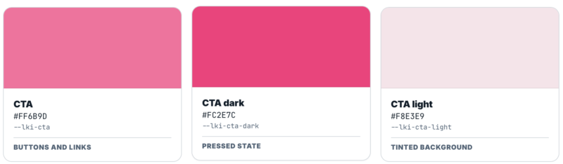
One colour in three states. Default, the darker pressed state, and a light tinted background.
Buttons, links, anything asking to be clicked. It’s not decorative: a person needs to trust that this colour always means action. That rule is easy to write and easy to break, and AI has a surprisingly hard time holding onto it. I’ve explained it a dozen different ways. Tokens are what finally fixed it.
Worth noticing that the group is called CTA rather than Secondary.
Additional colours
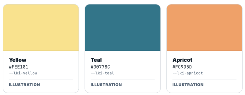
Illustration and editorial work. Used sparingly, outside the everyday interface, and not required for a layout to feel finished.
Semantic
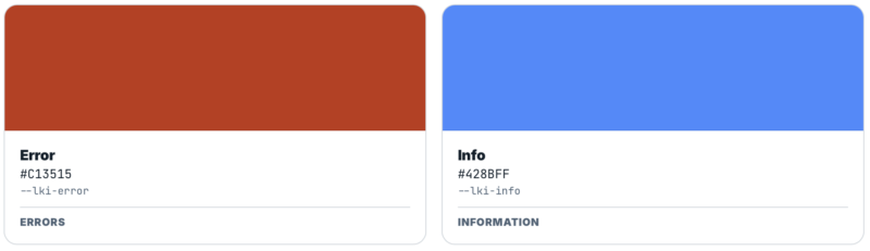
These are the colours an interface uses to tell you what happened: error, success, warning, or information. They don’t need to feel like the rest of the palette. In fact they should feel a little different, because the entire point is to jump out and grab your attention.
The usual four roles are Error, Success, Warning, and Info. My brand colour is green. A green that sometimes means “this worked” and sometimes means “this is Lara Kroeker Interactive” costs comprehension in both directions.
For LKI, all four values are now defined: Error red, Success green, Warning ochre, and Info blue. They are functional colours rather than brand colours, and colour is always paired with an icon and a written label so meaning never depends on colour alone. Seems like a small thing. I think about it more than I probably should.
What stays global and what has to stay custom
What working on five systems at once taught me is that none of the values are global. Not one. Every colour in every group is different on every brand, including the greys, which are built from that brand’s anchor colour.
What carries across is the structure and the rules.
Surface is three slots on every project and the rules never move: the page canvas, the card that lifts off it, the dark section that breaks the rhythm. Greys are five steps with the usage rule fixed to the number, so Grey 2 means body copy on every brand even though Grey 2 is a different colour on every brand. Additional colours stay outside the interface.
Brand colours and CTA are where the rules get written fresh every time, and I stopped trying to make them behave. One client has a single brand colour and nothing else. Another has two brand colours carrying different jobs, one for action and one for emphasis. The label matters less than the rule underneath. So the structure stays fixed and the paragraph explaining how to use it gets written differently.
Semantic sat in the first group until my own brand broke it. The four roles are stable, but their values cannot be assumed: a conventional semantic colour can collide with the brand palette, as green does for LKI. So it moved across: fixed structure, rules written per client, because you can’t know in advance whether a client’s brand is going to collide with a convention.
The names are the part a tool reads
Look at what the groups are called and a pattern shows up.
The interface groups are named for the job: white, neutral, dark, grey 1 through 5, CTA, error, success, warning, info. The brand and illustration groups are named for the colour: lime, green deep, yellow, teal, apricot.
That split isn’t decoration. Where the job stays the same on every project, the name states the job. Where the job changes per client, the name states the colour instead, because a role name wouldn’t hold.
It’s also why the group is CTA rather than Secondary. “Secondary” describes a position in a hierarchy. “CTA” describes what the colour does. One of those can be applied correctly by something that has never seen the design.

There’s a layer under this. The swatches show the values. What the theme actually references are roles, so a border reaches for the border role rather than for Grey 5 directly. Change the brand and you rewrite one alias block at the top of one file instead of hunting through a stylesheet. Reaching for a raw value in a template means a role is missing, and the fix is to add the role.
I always build a few real pages, or make a handful of social posts, while the Design Guidelines are still open, rather than handing them over and moving on. A palette that works as swatches and falls apart as an actual page is common. Building the page is the only way to catch it.
Drifting rules
A token file looks like a list of colours. What it usually contains is three colours that are almost the same colour.
That’s the thing you feel on a page without being able to point at it. A border slightly heavier on one section than the next. A grey that shifts between two cards. Nothing is broken and nothing looks wrong, but the page feels off. I can tell you exactly why: those near-identical values were each added on a different day for a different reason, and nobody went back and reduced them to one.
That’s not a design problem. It’s a naming problem, and it lives in the file, not on the page. Once a palette is locked into tokens on a live page, this kind of drift has nowhere left to hide.
Unclear guidelines
It also matters more now than it used to, because the file is what a tool reads. A tool has no eye. It can’t tell that Grey 4 and an unnamed value three percent away from it were meant to be the same thing. It applies what the file says. A file carrying three near-duplicates will produce off-brand work faster than a person could produce it by hand.
The old way was to write the guidelines and hope they were read the way I meant. That was always the weak point. Guidelines are exactly that: guidelines. Two people read the same page and build two different things, and neither of them is wrong. A named value doesn’t leave that room.
Guidelines get interpreted. A named token gets read.
Twenty years of colour theory used to live entirely in my hands. Now it lives there and in a token file, which means it can survive contact with a tool that’s never met me. That’s the whole point of doing this five times in one week. Not to get faster. To get certain. My gut was already right. Now it’s written down, numbered, and impossible to misquote.
Even by Claude.