Layout library

Ideas worth remembering.

Reference images, not live code. Add one by dropping it into the category's folder in the theme, no other step.

Layout is the part that doesn't show up in a screenshot. It's the decision under the decision: why text sits where it sits, why one section breathes and the next one doesn't, why a hero holds attention for exactly as long as it needs to and then gets out of the way.

Anyone can grab a template. What's harder is knowing which shape actually serves the content, before a single word gets written. This is where that thinking gets kept, not finished work, not code ready to drop in, just the moments that made me stop and look twice. The next project that needs a certain kind of hero starts here instead of from scratch.

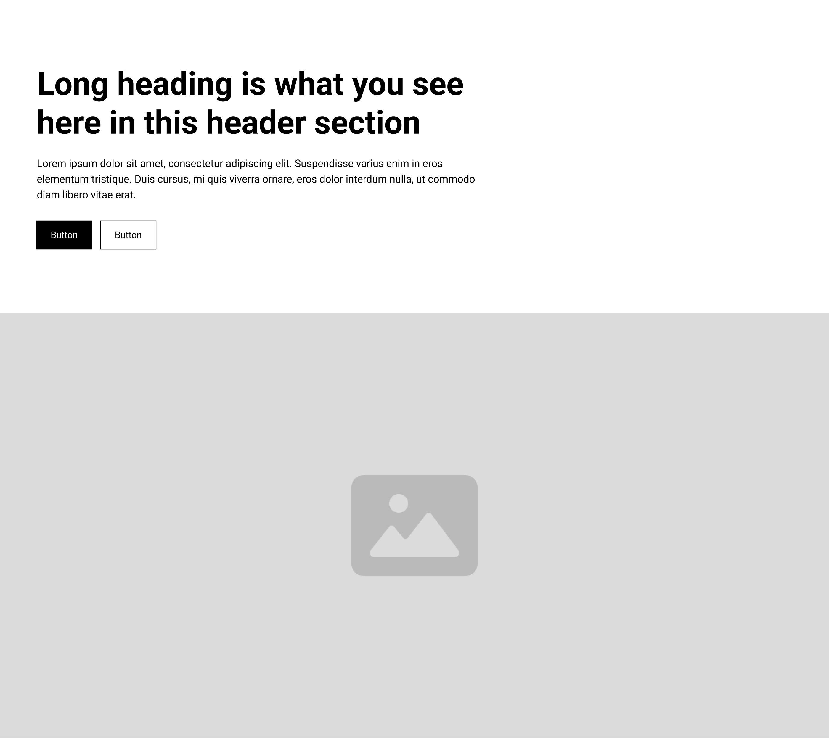
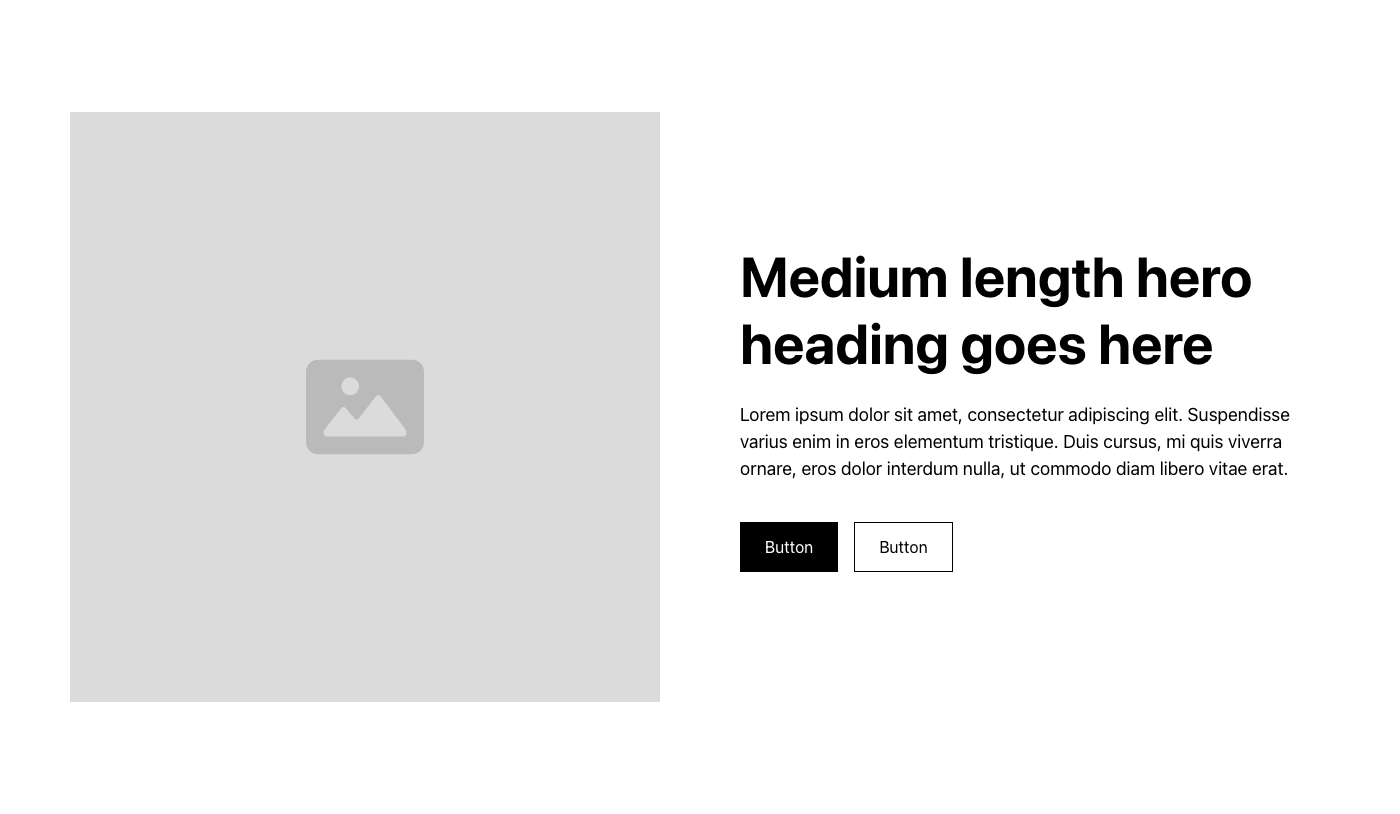
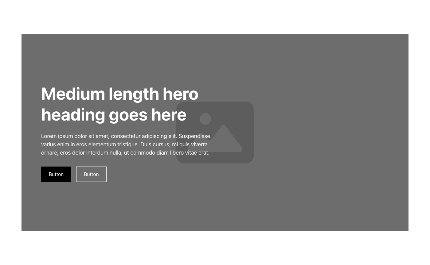
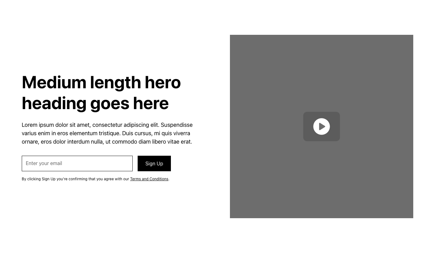
Hero Header Sections

Open folder ↗

assets-layout-library/Hero Header Sections/
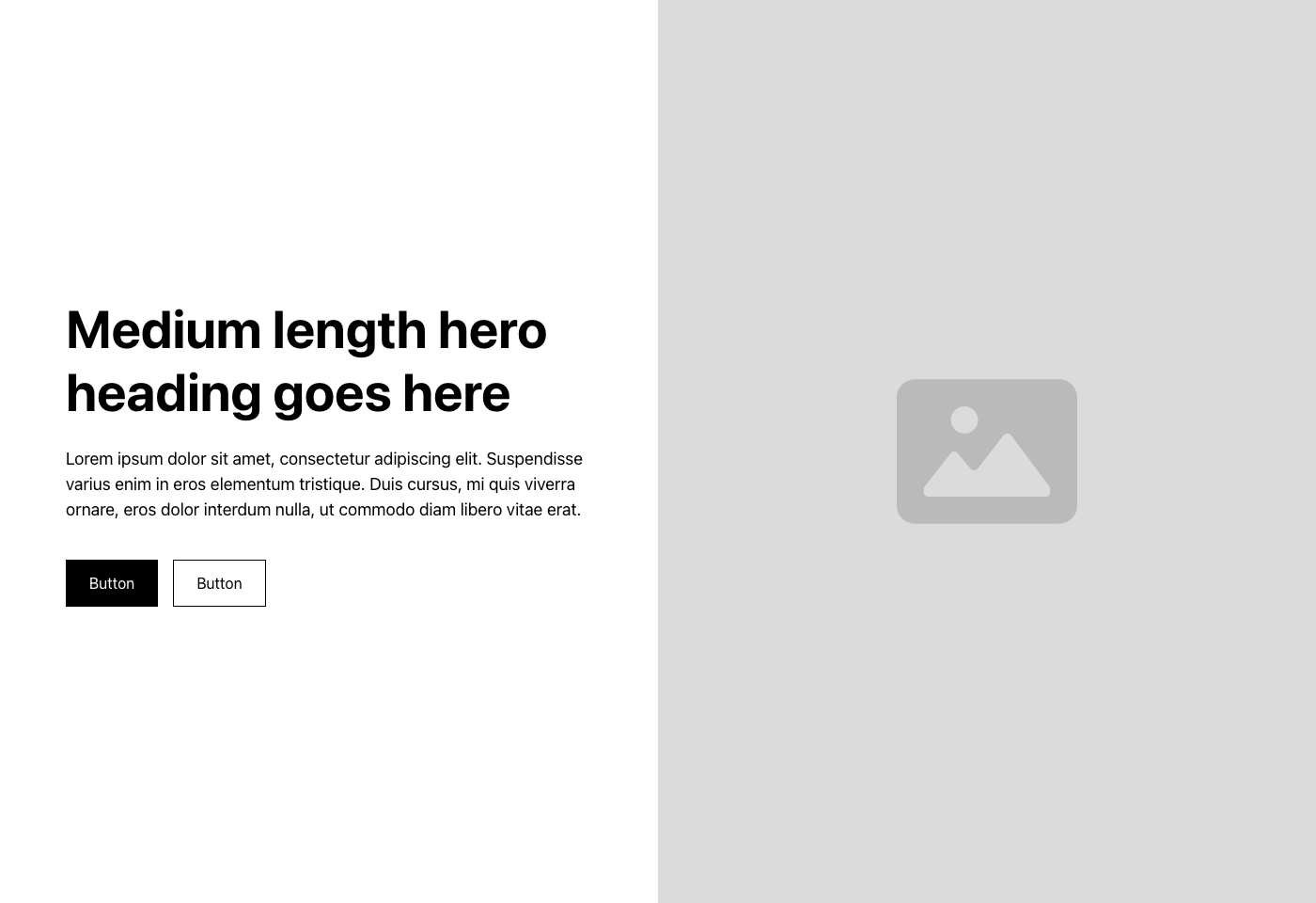
Hero 1.png
Hero 1.png
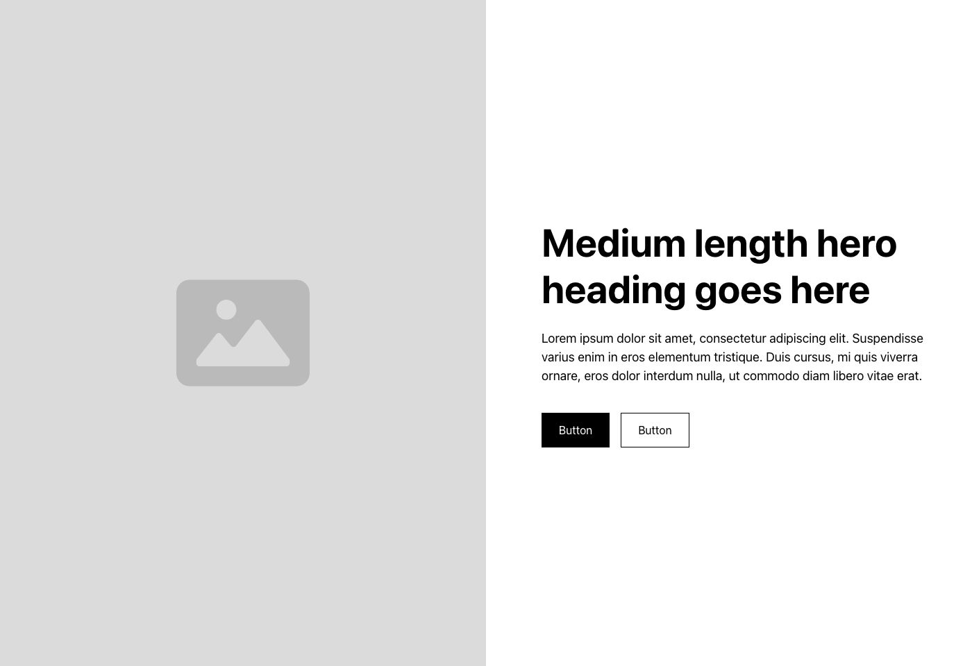
Hero 2.png
Hero 2.png
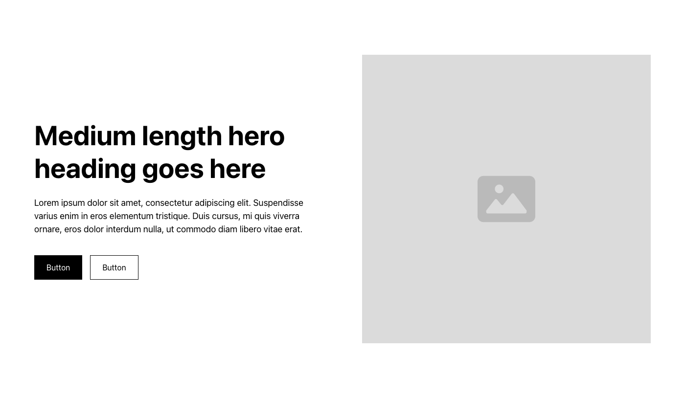
Hero 3.png
Hero 3.png
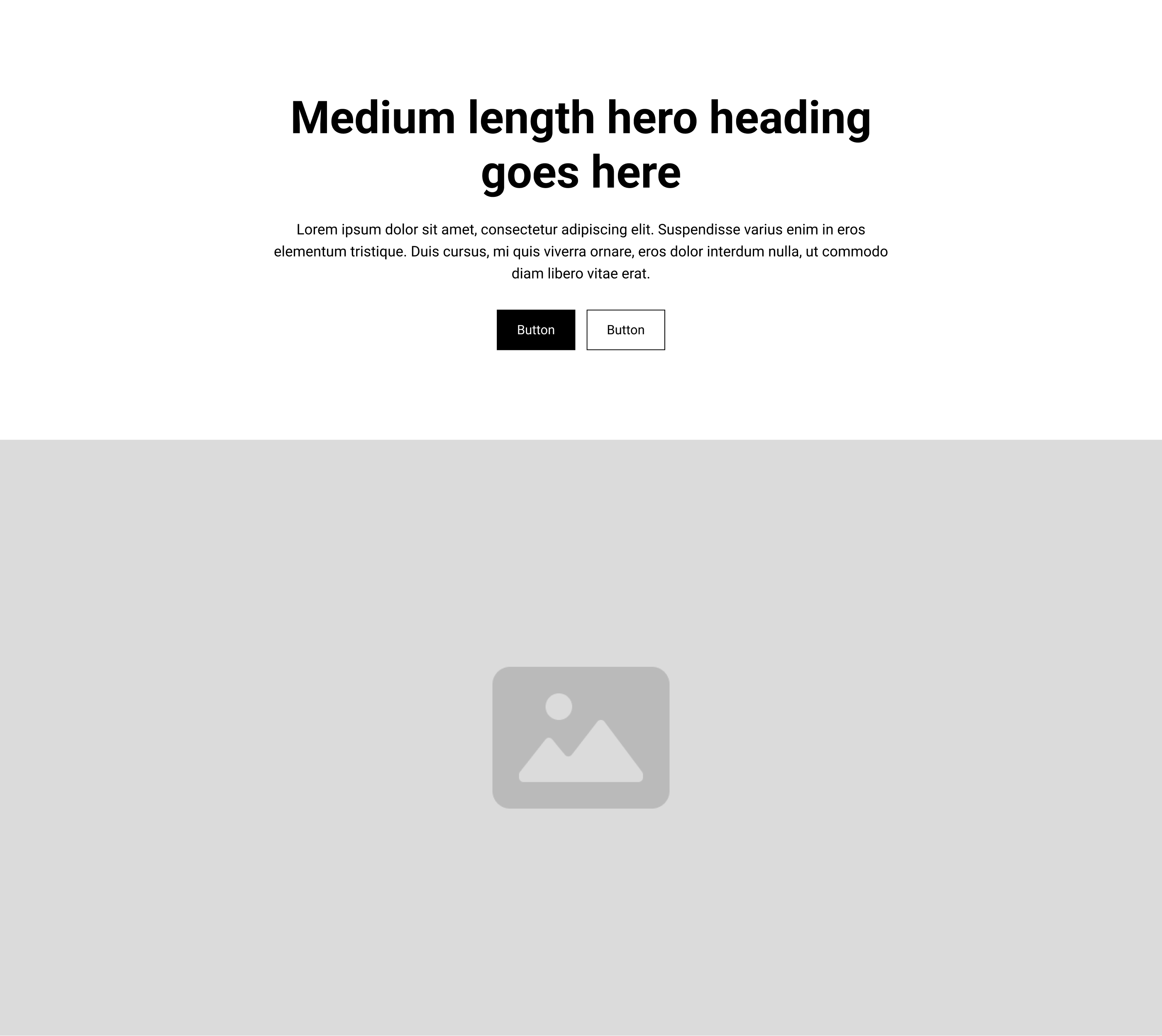
Hero 4.png
Hero 4.png
Hero 5.png
Hero 5.png
Hero 6.png
Hero 6.png
Hero 7.png
Hero 7.png
Hero 8.png
Hero 8.png
Hero 9.png
Hero 9.png
Hero 10.png
Hero 10.png
Hero 11.png
Hero 11.png
Hero 12.png
Hero 12.png

Feature Sections

Open folder ↗

assets-layout-library/Feature Sections/

No references yet. Drop an image into assets-layout-library/Feature Sections/, commit, push.

CTA Sections

Open folder ↗

assets-layout-library/CTA Sections/

No references yet. Drop an image into assets-layout-library/CTA Sections/, commit, push.
Socials

Different formats.

Blog format.

One real post in each: title, date, featured image and permalink, pulled live from the Blog category.

New on the blog · Sep 8
Creativity Needs a Foundation
Read the post

Scrim — Full-bleed photo, dark gradient, headline bottom.

Aug 25
Why the Concept Never Quite Survives the Build
Read more

Navy frame — Dark card, rounded photo well inset at top.

On the blog
You Don’t Read Websites. You Scan Them.
Read the post

Split light — Photo top 58%, white panel with headline below.

From the blog
Why I built five Design Guidelines at once
Read more

CTA flash — Pink background, circular cropped photo, pill CTA.

Aug 9
My Website Is a Guinea Pig and I’m Fine With That

Corner badge — Date pill top-left, circular pink arrow button bottom-right.

New on the blog
What I Learned From Living in My Basement
Read more

Neutral float — Light card, photo floating with shadow-xs.

Jul 19
What Does Excellence Look Like Right Now?

Duo-split — Dark-to-lime colour block, photo overlapping the seam.

From the blog
What Happens When You Stop Designing for Everyone?
Read more

Type-only — Oversized headline on navy, small photo chip + link.

Jul 5
The platforms change. The fundamentals don’t.
Read more

Duotone bar — Green-tinted photo, solid dark bottom bar.

Testimonial format.

Bold statement format.

Let's talk

If you're trying to make something clearer or more cohesive or more useful, let's talk.

Book a discovery call