I have built more Design Guidelines than I can easily count, and colour is the section I know best. I can look at a palette and tell you in seconds whether it holds together, the same way I could years ago. What I had never done was write the rule down. So each set of guidelines got whatever version of it I was carrying that week rather than the one I actually mean.
So I wrote it down. Then I spent a day applying it to four brands at once, which is the only honest way to find out whether a rule survives contact with work you have already shipped.
It did not, in a few places. That turned out to be the useful part, and it is most of what follows.
Six groups and always the same six
The framework is fixed now. Not derived per client, not shaped around whatever the colour file happens to contain. Six groups, in this order, and the client’s colours get mapped into them:
Neutrals. Primary. Secondary. Greyscale. Additional colours. Semantic.
A group with one colour in it is honest. A group with none gets dropped, and that absence tells you something too. Starting from the frame rather than from the palette is the whole point: otherwise you end up documenting what you happened to build instead of deciding what you meant.
Neutrals
Three. White, Neutral, Dark. Every layout sits on one of them, and nothing outside these three is a background.
Neutral is the page. White lifts a card off it. Dark is the section that breaks the rhythm. Three is enough because the moment there are five, nobody can tell you which one a new card is supposed to use.
These are not picked independently of the brand. Even a site that reads as plain white usually has a whisper of the brand hue underneath, which is what stops a page looking like a pile of greys that happen to be sitting near each other.

Primary
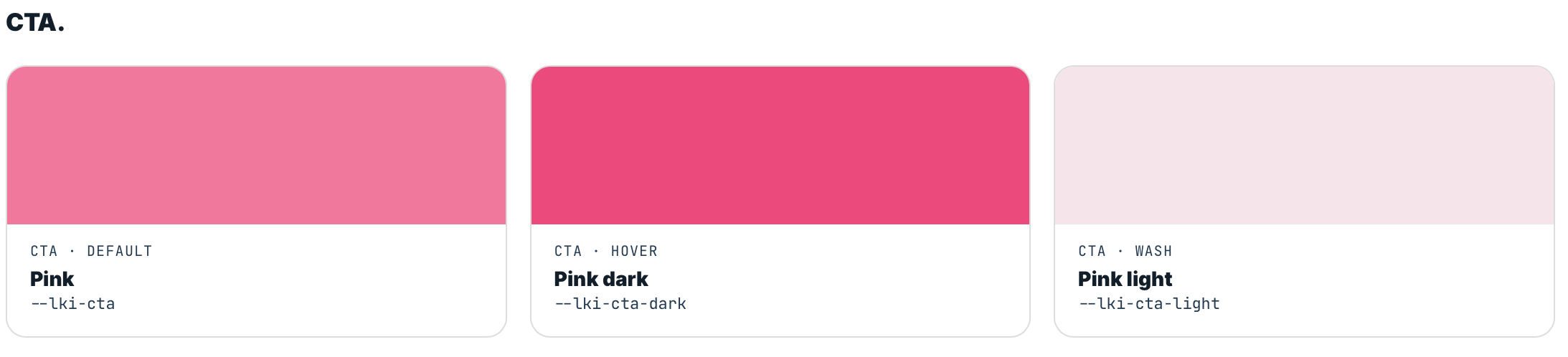
The text colours, darkest to lightest. Three of those as well: body copy, a muted one for captions and metadata, and a soft one that is too pale to read.
That last one is the trap. On one of the four brands I checked it against a real background and got 2.5:1, which fails the accessibility threshold for normal text and also fails the lower one for large text. The brand’s own notes described it as a text colour. It is not. It is a divider and placeholder colour, and now it says so.
Calling this group Primary is deliberate, and it is the thing people find counter-intuitive. The colour a reader meets most is not the logo, it is the one the words are set in.
Secondary
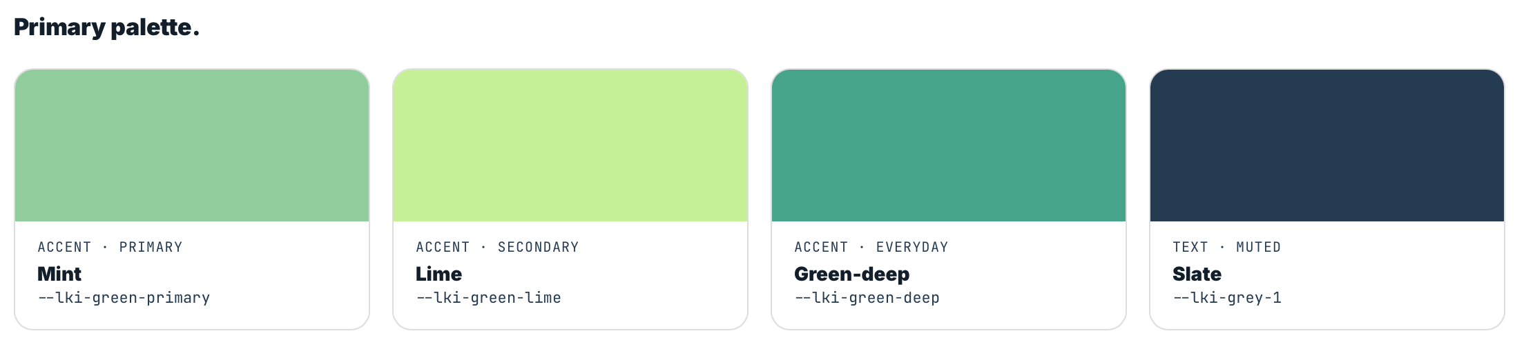
The brand accent, in three states: default, the darker hover and pressed state, and a lighter supporting variant.
This is the signature. The colour someone associates with the brand before they could tell you why. It fills buttons, colours links, and does the one editorial flourish a page is allowed.
Because it is the action colour, it is never decoration. That rule is easy to write and easy to break: on my own site I found links on dark sections rendered in the accent green rather than the action pink, which taught anyone reading that green is sometimes clickable and sometimes not. The second an action colour appears as decoration, the eye stops trusting it everywhere else.
Greyscale
Five, chosen on purpose rather than accumulated one project at a time.
Two details make the difference between a scale and five greys. The first is that they step evenly in perceptual lightness, not in hex value. My own ramp runs L* 24, 41, 56, 72, 86, so each step looks like the same size step to a person, which is not what you get by nudging hex codes until they feel right.
The second is that greys carry a hint of the brand hue instead of being pure neutral. I proved this one backwards. On a brand where the palette is warmed, I added a pure neutral ramp and it read cold against everything around it, immediately and obviously.
The greyscale is also where borders come from. Every hairline on a site should be a step on this ramp rather than a one-off value picked in the moment, which is how a border ends up three different strengths on three different sections of the same page.
Additional colours
Illustration colours, chart colours, anything with a job outside the interface. Three is usually plenty.
These stay completely outside the interactive system. Never a button, never a link. They exist to put life into an illustration or a graph, and a layout should feel finished without them.
Worth checking their contrast anyway, and then writing down what you find. All three of the ones I added most recently are too light to set text in. That is fine, they are fills, but it needs saying on the page or someone will try.
Semantic
Two, usually. Red says something failed, green says it worked.
These stay conventional on purpose, because a person reads the meaning before they read the design. A green that means anything other than “this worked” costs comprehension, and that is a poor trade for novelty.
They are also the one group that carries across a client build more or less unchanged.
The part that makes it real
A palette written down is a claim. The claim is what drifts.
So the colour page on each site renders its swatches from the live values rather than from hex codes typed into it, and it computes its own contrast ratios in the browser on load. Change a colour in the file and the page changes with it. It cannot state a colour the site does not have.
That is not theoretical tidiness. Building it is what caught the errors in this post. On one site the printed hex disagreed with the swatch beside it, because the colour file ended with a dark-mode block and the page was reading the last value it found rather than the first. Five of twenty-one colours were wrong, on the page whose entire job is to be right about them. It was only visible because the measured contrast and the printed number disagreed with each other.
Two readings of the same colour is what makes a page able to catch itself. One number, however carefully sourced, cannot.
What I actually found
Naming the rule was the easy half. Applying it to four brands in a day turned up a set of problems that had been sitting there in plain sight:
A colour whose stated job contradicted the file it lived in, where a role meant for text pointed at a grey the same document said to never set text in. Ten unnamed transparencies of one colour where the system defined two, which is how the same edge ends up at three different strengths. Borders invented on the spot instead of taken from the scale. An accent used for links. A text colour that fails contrast at any size.
None of it was visible from looking. All of it was obvious the moment something measured it.
That is the argument for writing the rule down and then going back through the work with it, rather than carrying it around in your head and assuming the last five projects match. Mine did not.