Two years, one festival that never stood still, and a brand built to move with it.
Signals is DigiBC’s creative tech expo, an immersive festival exploring AI, XR, gaming, and interactive media through dozens of curated projects, artists, and technologists. It launched its first year needing a complete identity and online experience under VIFF’s umbrella but distinct from it. The following year, the festival’s focus shifted, and the brand and site shifted with it.
Design Guidelines and an online build came first, the same foundation every engagement starts from. What followed over the next two years went well past a single launch: a full rebuild the second year around the festival’s new direction, ongoing site work in between, two members of the Signals team trained to make their own updates, and a run of work that grew to include artist interview videos cut for social, social strategy, and print posters, none of which were part of the original scope.
The festival’s own timeline moves fast, programming locks late, artists confirm close to the date, and the work had to stay iterative and responsive to match it rather than holding to a plan set months in advance.
Signals needed its own identity from the start, distinct enough to stand apart from VIFF while still reading as connected to it. Thirty five projects across AI, gaming, XR, and Indigenous-led work risked feeling fragmented without a clear structure to guide an audience through it.
The second year raised a different problem. The festival’s focus had moved, and a brand and site built for the first year’s programming would not fit the second year’s without a real rebuild, not a light refresh. At the same time, the Signals team needed to be able to make routine updates themselves rather than routing every small change back for a full engagement.
Beyond the website, Signals needed a consistent presence everywhere its audience actually was: social video featuring the artists, a cohesive social feel, and print materials for the physical event. None of that was in the original scope, but without it the online identity would not have matched what people experienced at the festival itself.
Design Guidelines were built first each time the festival’s direction changed, so the brand had something settled to check against before the site or any other material was touched. The online build followed the same planning process as every engagement, structure and content worked out before production, so the rebuild between year one and year two was a genuine redesign rather than a patch job.
Two members of the Signals team were trained directly on the website, so day to day updates, program changes, new artist additions, did not need to wait on outside help. That handoff mattered more here than in most engagements, because the festival’s content changes faster than any external schedule can keep up with.
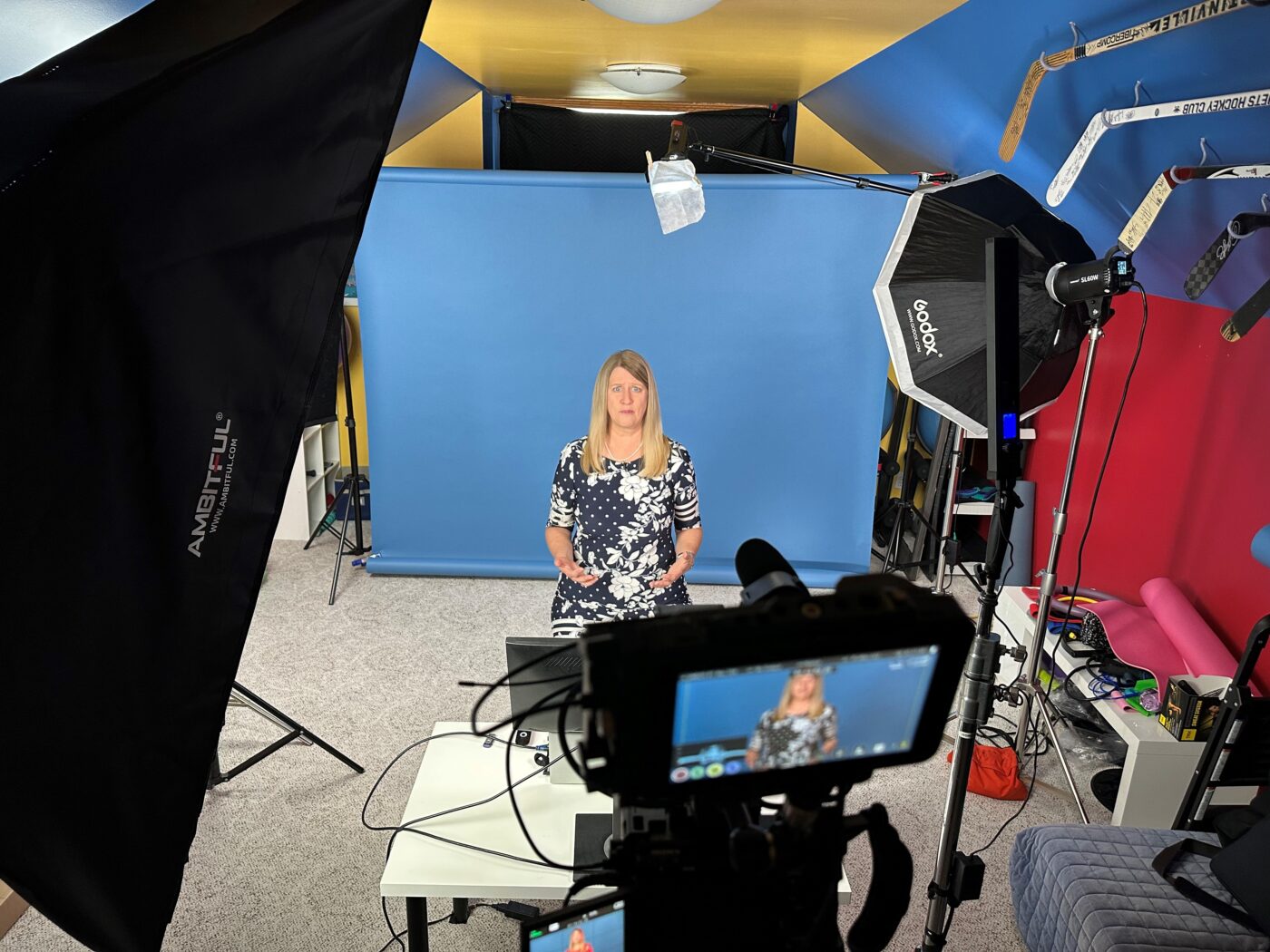
The scope grew past design and build because the festival needed it to. Artist interviews were shot and cut into videos for social, a social strategy tied that content back to the brand’s visual identity, and print posters carried the same system into the physical event. None of it was originally scoped. All of it kept the brand consistent everywhere the audience encountered it.
“As the driving force behind the event’s branding, digital marketing, and print design, Lara elevated every aspect of this ambitious expo,” says Loc Dao, CEO at DigiBC. “Her strategic vision and creative execution ensured that Signals stood out as a cutting-edge showcase for interactive and immersive technologies.”
The first year sold out, with a brand and site clear enough to convert interest into attendance. The second year’s rebuild carried that same clarity into the festival’s new direction instead of forcing an outdated identity to stretch over it.
Two years in, Signals has a foundation that has now been rebuilt once, updated constantly in between by its own trained team, and extended into video, social, and print without losing a consistent identity across any of it, proof that a brand built to hold up does not mean a brand that stays static.
One brand, several programs, one identity that holds them together.
A national brand for Canada's interactive industry, built in two weeks.
A brand and an online build for the Magazine Association of BC, and an ongoing partner for whatever new program comes next.