Agency owner
Colette
Runs a small creative or digital agency and needs an experienced design-and-build partner who can extend the team without adding another layer of management.
The source of truth for the Lara Kroeker Interactive visual identity — colour, type, logos, photography, icons, spacing, and the rules around them. Follow these whenever you create or update anything for LKI.
Purpose
To build online experiences on foundations solid enough to outlast the platform they’re built on, so clients get design leadership and technical execution from the same person instead of losing time and context between the two.
Vision
A practice where twenty years of watching platforms come and go plugs directly into whatever tool or AI workflow comes next, without the foundation ever needing to be rebuilt.
Mission
Closing the gap between strategy and execution on the design side, and between what AI can do and how organizations actually adopt it, one engagement at a time.
Clear, not clever.Lead with the useful point; personality comes after understanding.
Confident, not inflated.Be specific about the work without hype or oversized claims.
Human, not corporate.Write directly, in first-person singular, without filler or unexplained jargon.
Three audience types guide the examples, priorities, and level of explanation in LKI work. They are practical archetypes, not demographic profiles.
Runs a small creative or digital agency and needs an experienced design-and-build partner who can extend the team without adding another layer of management.
Leads a member-based, cultural, or non-profit organization and owns the website alongside everything else. Needs clarity, momentum, and a system the team can maintain.
Has an established offer and a growing expert-led business. Needs the brand and website to catch up, with strategy and execution handled as one connected engagement.
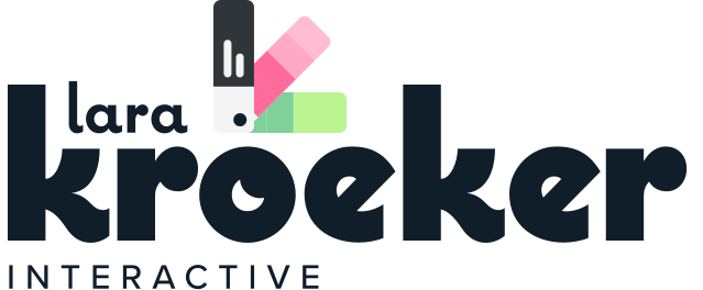
Organize logos by mark, surface, and format, showing only approved versions. LKI uses a horizontal wordmark when fully legible and a compact icon at smaller sizes. Never redraw, recolour, stretch, rotate, or place logos on low-contrast backgrounds, and leave clear space equal to the “lara” line around the wordmark or the blue pencil stem around the icon.
Primary lockup
Use for headers, footers, documents, and layouts with enough horizontal room.
Compact mark
Use for avatars, favicons, app tiles, and spaces where the wordmark becomes too small. One universal file is approved on both surfaces.
The compact mark at the sizes where the wordmark cannot remain legible.
 180px
180px
 48px
32px
48px
32px
A third-party credential, kept separate from the LKI logo family and shown on its intended surface.
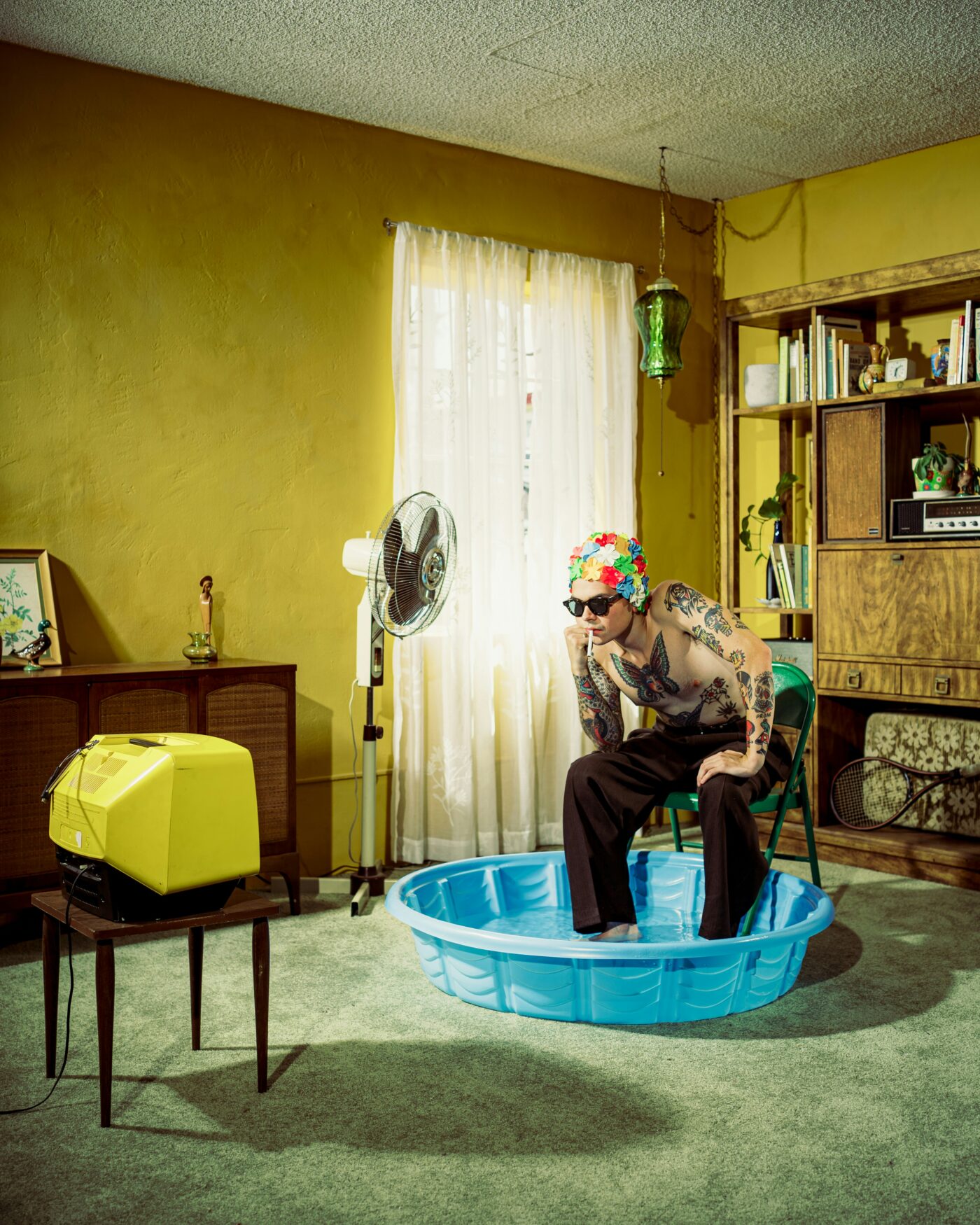
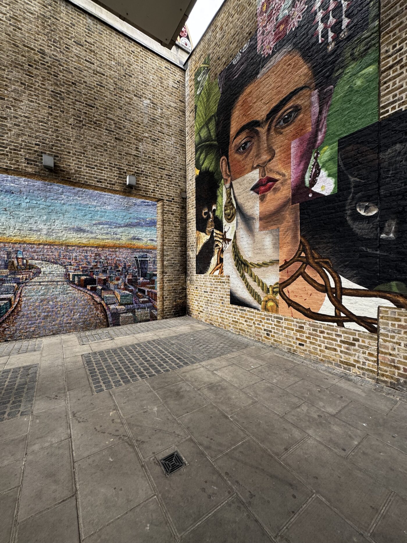
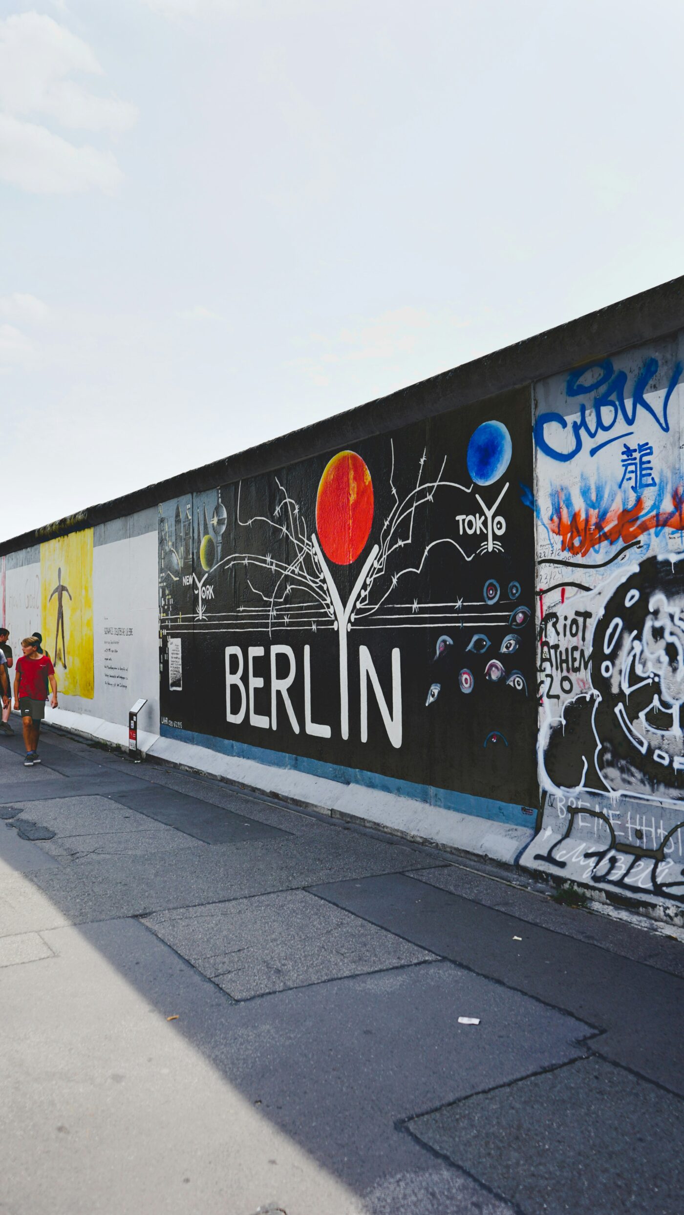
Photography should feel candid, specific, and editorial, using real environments, observed moments, clear subjects, confident crops, and useful negative space. Avoid staged business scenes, generic stock imagery, and heavy filters.







LKI uses two icon sets. Animated Lordicon icons create motion and emphasis at section level; light-weight Phosphor icons handle static utility, navigation, and inline interface moments.
Phosphor, Light weight, always this suffix. A sample below, 1,412 in the full set.
 chat-centered-dots
 calendar-blank
 camera
 cloud-arrow-down
 file-archive
 folder-dashed
 gear
gear
 globe-hemisphere-east
 heart
heart
 house
house
 image-broken
 lightbulb-filament
 lightning-a
 lock-key
 map-pin-area
 moon
moon
 music-notes
 paint-brush-broad
These are the three core surfaces: page canvas, raised cards, and dark sections. The theme also uses one full-lime statement band and one pale-grey section band as deliberate, limited exceptions.
The colours that make the work recognizably LKI. They are named for what they look like because their exact job can change by context; the usage note on each swatch says what it does here. The number of Brand colours is not fixed: another client may need fewer or more, but every colour must have a real role rather than filling a quota.
Five even steps, numbered dark to light, tinted toward the brand rather than neutral. Grey 1 and 2 are safe for body text. Grey 3 needs to be large. Grey 4 and 5 are fills and borders, never type.
One interaction colour in three strengths. Pink marks links, arrows, hover and pressed states; the main filled button rests dark. It is never decorative, so people can trust that pink signals action.
Illustration and editorial colours used outside the everyday interface. They may appear in social posts and other editorial graphics with restraint, supported by the core brand palette rather than replacing it. A layout should not need them to feel finished.
Four conventional interface meanings belong in the system whether or not the brand uses similar hues. They are functional colours, not Brand colours. Always pair them with an icon and written label so meaning never depends on colour alone. Error, Success, and Warning pass AA for normal text on white; Info is for icons or large text on white, and passes AA for normal text on dark.
These foreground and background pairs are approved for normal text. Do not reverse the lime or pink pairings to light text; both need the dark foreground to remain readable.
Lead paragraph, for openings and introductions.
Body copy, the standard reading size used everywhere else.
Small text, for captions, buttons and list items.
Editorial accent
Sentence case everywhere — headings, subheadings, buttons, body copy. Capitalise the first word and proper nouns, nothing else.
Sentence case — use this
Great design shouldn’t break in the build.
A few things built recently.
Book a discovery call
Title Case — not used
The Single-Operator Fix
Book A Discovery Call
Capitalising every major word is not part of this system, in any context.
ALL CAPS — a treatment, not a way of writing
Design and development
The caps above come from CSS (text-transform: uppercase plus letter-spacing) and are used on eyebrow labels only. The text itself is written in sentence case. Never type words in capitals, and never set a heading, a button or a sentence in caps.
The three scales nobody looks at directly. Spacing sets the rhythm, radius gives every edge its character, and elevation decides what sits above what. All three are fixed lists, so each decision is made once and reused.
Use the defined scale for recurring component and section rhythm. Unique structural measurements such as container widths and navigation height may sit outside it when the layout requires them.
Radius gives each interface edge a consistent character, from square structural surfaces to soft cards and pill-shaped actions.
The curve applied to an interface element. Smaller radii belong to dense controls, while larger radii belong to cards and surfaces. Buttons and tags use their own defined treatment.
The visual difference between surfaces. Flat is the default; borders and shadows are used only where they clarify hierarchy, grouping, or interaction.
The interface stays flat, readable, and predictable. These are the recurring pieces most likely to be recreated incorrectly; each specimen uses the same classes and tokens as the working site.
White, a light hairline, 14px corners, and only a quiet lift on hover.
Pink is reserved for interaction, so it remains recognizable wherever a link appears.
Read the next step →1240px maximum container · 80px desktop gutters · 48px tablet · 32px mobile
Three levels of emphasis: a filled pill for the main action, an outline for the secondary one, and a ghost link for everything else. Aim for one filled button per view. Hover fills with the CTA pink and pressing deepens it, so the rollover reads the same everywhere. Labels on that pink stay dark rather than white, which is a contrast requirement and not a preference.